Steven Nash

eCommerce and Digital Marketing

Month: February 2011

How NOT to advertise your special offer by three.co.uk

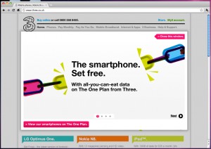
After poor signal coverage I’m leaving Orange soon. As I use a lot of data I thought I’d take a look at Three and their website confused me in less than ten seconds. I arrived on the site with a clear goal in my head, landed on the site and scrolled down to find what I wanted. I wanted to look at a SIM only plan but couldn’t click on the link. Hell, I couldn’t click on ANY of the links.

Because I spend most of my day trying to spot issues like this, I wondered incredulously about that special offer graphic at the top of the page, the one I’d scrolled past quickly because I’m a task-oriented user… could that be a lightbox advert on the page?

three's very dumb homepage advert

Oh. My. God!

I tune out special offers if I am on a website with a clearly defined goal. It’s not that you shouldn’t promote a special offer- but it should be aimed at users who are just browsing. This offer would have worked just as well as an ordinary graphic featured in a similar position on the homepage. Hijacking control in this way is actually even worse than the old popup browser window adverts because the user cannot ignore it- he has to close it before any other action can be performed in the current window.

The background is a very light grey, the lack of an obvious contrast left me scratching my head wondering why I couldn’t click around the rest of the site. The lack of an ‘X’ in the top right didn’t help either. I’d be very interested to know what happened to the bounce rate of the three.co.uk homepage for the duration of this unconventional (and frankly bonkers) approach.
How to write headlines for paid search landing pages

“On the average, five times as many people read the headlines as read the body copy” stated David Ogilvy. A compelling statistic, but how does this translate to your web site?

Ogilvy continues; “unless your headline sells your product, you have wasted 90 per cent of your money.”

Ogilvy may have been writing about print ads from the 1960’s but he could be talking about paid search landing pages. I’ve often found that the quickest way to slash a bounce rate on a keyword that isn’t performing as you’d like is to craft a better headline.

So as paid search marketers what should we look for in a headline?

Best-selling author and copywriter Andy Maslen suggests that a headline should ‘make the reader want to read the body copy’ and encapsulate the ‘sales pitch in 10-16 words or fewer.’ But when drafting a headline it’s important to remember that users make a very quick judgement about whether they are in the right place, and in order to keep that Quality Score as high as possible you should try to get that user’s search keyword in either the headline or an immediate subheading.

Here are some quick tips which might help…

Split test your headlines

You’ll never know what works until you test! Claude Hopkins spent ‘far more time on headlines than on writing’ and Ogilvy never wrote ‘fewer than sixteen headlines for a single advertisement’. Both copywriters would split test headline effectiveness by measuring coupon redemption. Thankfully, we can split test testing is now easier than ever with Google Content Experiments.

Write a series of headlines, split test them to see which generates the most conversions. It’s easy (and free)!

Find the right tone of voice

Different products require a different approach. I’ve tried what I thought was a compelling headline that grabbed attention and found that a dry and boring one actually achieved a better conversion rate.

An attention grabbing headline might undermine trust if it’s applied to a product that calls for a more subtle or formal tone. Test your ideas.

Read the news

Try and spot good headlines.  Journalists are experts at summarizing an article in as few words as possible. Some write headlines that grab your attention and compel you to read on. It’s worth reading Jakob Nielsen’s opinion of the headlines used on BBC News.

Powered by WordPress & Theme by Anders Norén